Challenge
This case study focuses on the branding of a real estate marketplace named Immoly. My goal was to create a distinctive brand identity that would stand out in a competitive landscape. The primary challenge was to design a brand that not only resonated with a younger audience but also evoked feelings of comfort and belonging. The design needed to be engaging and playful, enabling potential buyers to envision themselves in the properties featured on the platform.
Process
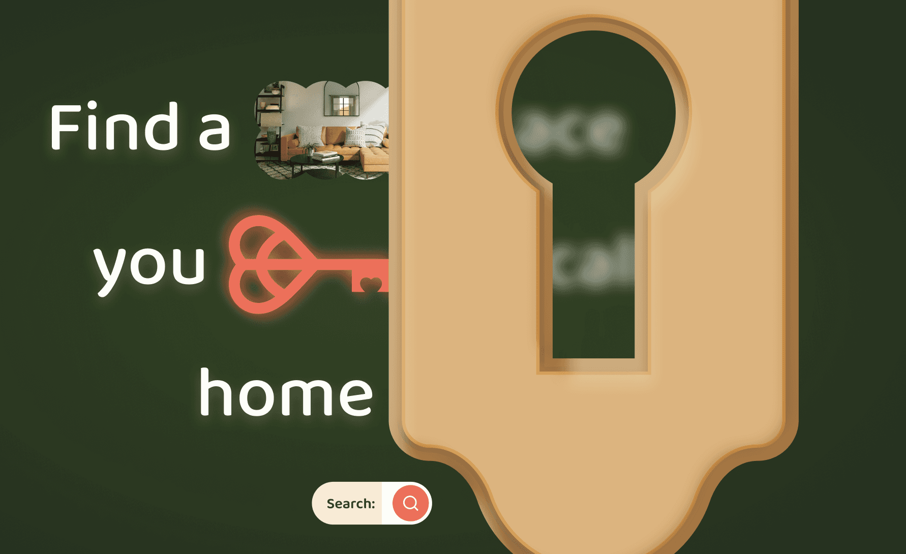
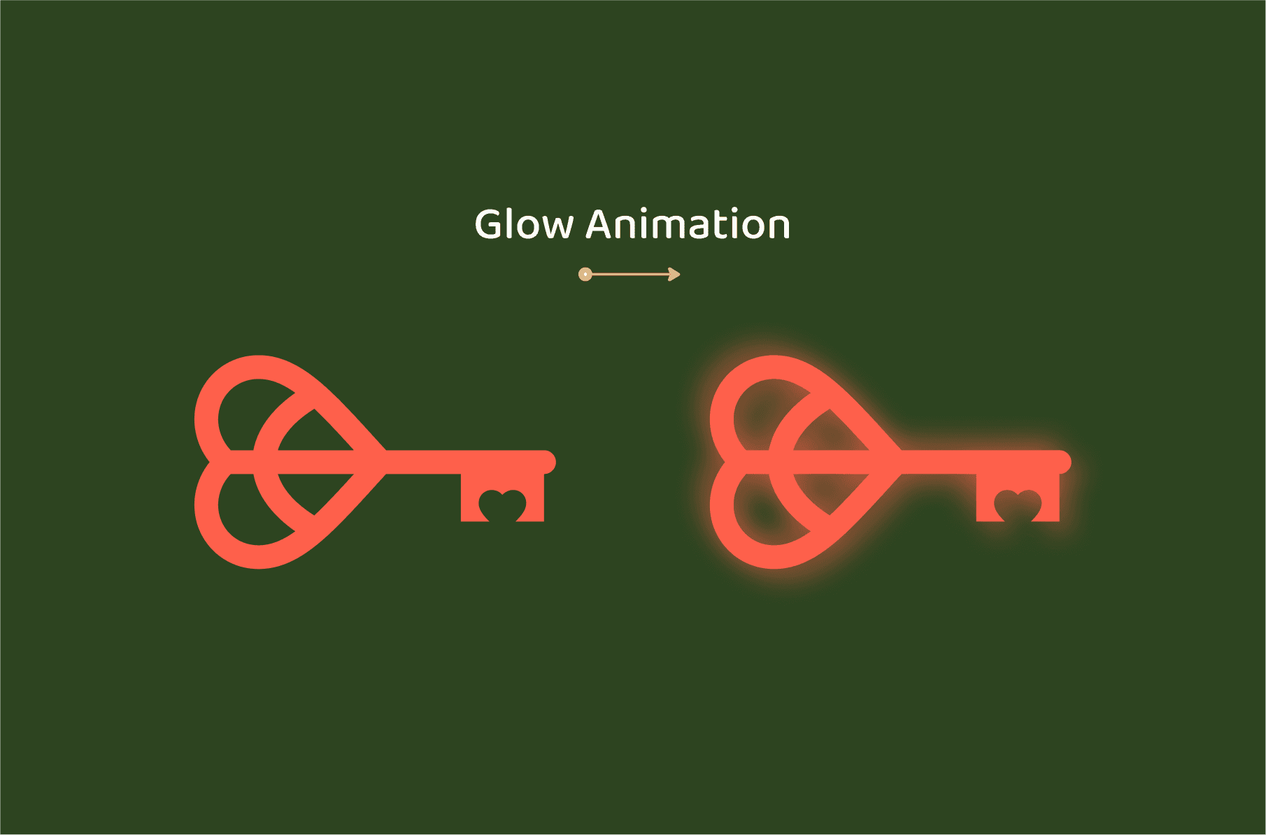
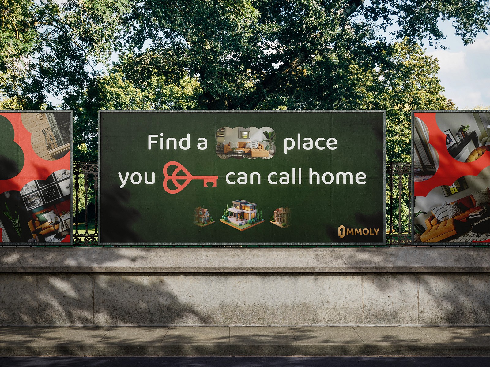
The branding journey began with the development of a unique logo, where the "I" in Immoly was creatively designed as a keyhole, symbolizing the quest for the perfect home. A carefully curated color palette was selected to establish a youthful yet cozy atmosphere. Additionally, heart-shaped keys were incorporated into the design to enhance the emotional connection associated with finding a home.
Solution
The final brand identity for Immoly effectively merges fun and engagement while allowing ample room for imagination. The hero section features an engaging animation that captivates users and invites exploration. Emotional messaging, such as "Find a place you can call home," resonates with the target audience. Overall, Immoly emerges as a fresh and inviting brand that stands out in the real estate marketplace, appealing to young home seekers while exuding warmth and comfort.
35%
25%
84%

